What is ChatGPT Images 2.5?
ChatGPT Images 2.5, also written GPT Image 2.5, is the image model OpenAI released on September 8, 2026. It brings sharper detail, more natural lighting and texture, better preservation of the subjects in your reference photos, steadier editing across a long conversation, and generation up to 50% faster than Images 2.0.
Two things about it change how you work rather than just what comes out. There are now two models to choose between, and there are two quality tiers above the old ceiling. Everything else in this guide is about writing the prompt, and that part has not changed shape: the habits that worked on GPT Image 2 still work, they just return more.
Flare or Sunburst: which model to use
The API ships two models and Morphic runs both. Asking for ChatGPT Images 2.5 gives you GPT-Image-2.5 Flare.
| GPT-Image-2.5 Flare | GPT-Image-2.5 Sunburst | |
|---|---|---|
| Built for | Fast, high-quality everyday work | Premium work needing control across edits |
| Quality | Comparable to GPT Image 2 | Higher than GPT Image 2 |
| Speed | Up to 50% lower latency than Images 2.0 | Longer generation times |
| Reach for it when | Social content, product shots, concepting, volume | Campaign creative, polished product imagery |
OpenAI's selection advice runs one way, and it is worth following. If your current work already meets your quality bar, start on Flare and see how much time you get back. If it does not, start on Sunburst, establish the quality you need first, and only then test whether Flare clears the same bar. One trap: a speed gain on one workload does not carry to another. Render time varies by model, prompt, reference images and quality setting, so measure both on your own work rather than trusting a headline figure.
The ChatGPT Images 2.5 prompt formula
Five habits do most of the work. Everything further down is an example of one of them.
| Habit | What it looks like | What it fixes |
|---|---|---|
| Describe a picture, not keywords | A vintage travel poster of a harbour town at golden hour | Vague output from adjective lists |
| Quote the words and count them | The tagline "Yours to Create" appears exactly once | Misspelled, invented and duplicated text |
| Say what you do not want | No glamorization, no heavy retouching, no extra text | The glossy AI-poster look |
| Label the sections for long briefs | Scene: / Style: / Constraints: / Include ONLY this text: | Instructions lost inside a paragraph |
| One change per edit turn | Change the label to matte black, keep everything else exactly | Drift across a chain of edits |
The fourth one is the newest habit and the least obvious. For a short request, a sentence or two is plenty. Once a brief has more than a handful of requirements, OpenAI's own examples stop writing paragraphs and start writing labelled blocks: Scene:, Mood:, Style:, Constraints:, and where copy is involved, Include ONLY this text (verbatim):. The format itself carries no magic. It just stops a requirement from getting lost in the middle of a wall of prose, and it makes the prompt something you can edit next week.
Writing your first image prompt
Name the subject, the setting and the light in plain sentences. Words like "beautiful" or "4k" do almost nothing, because they do not tell the model what to put in the frame.
| Weak prompt | Strong prompt |
|---|---|
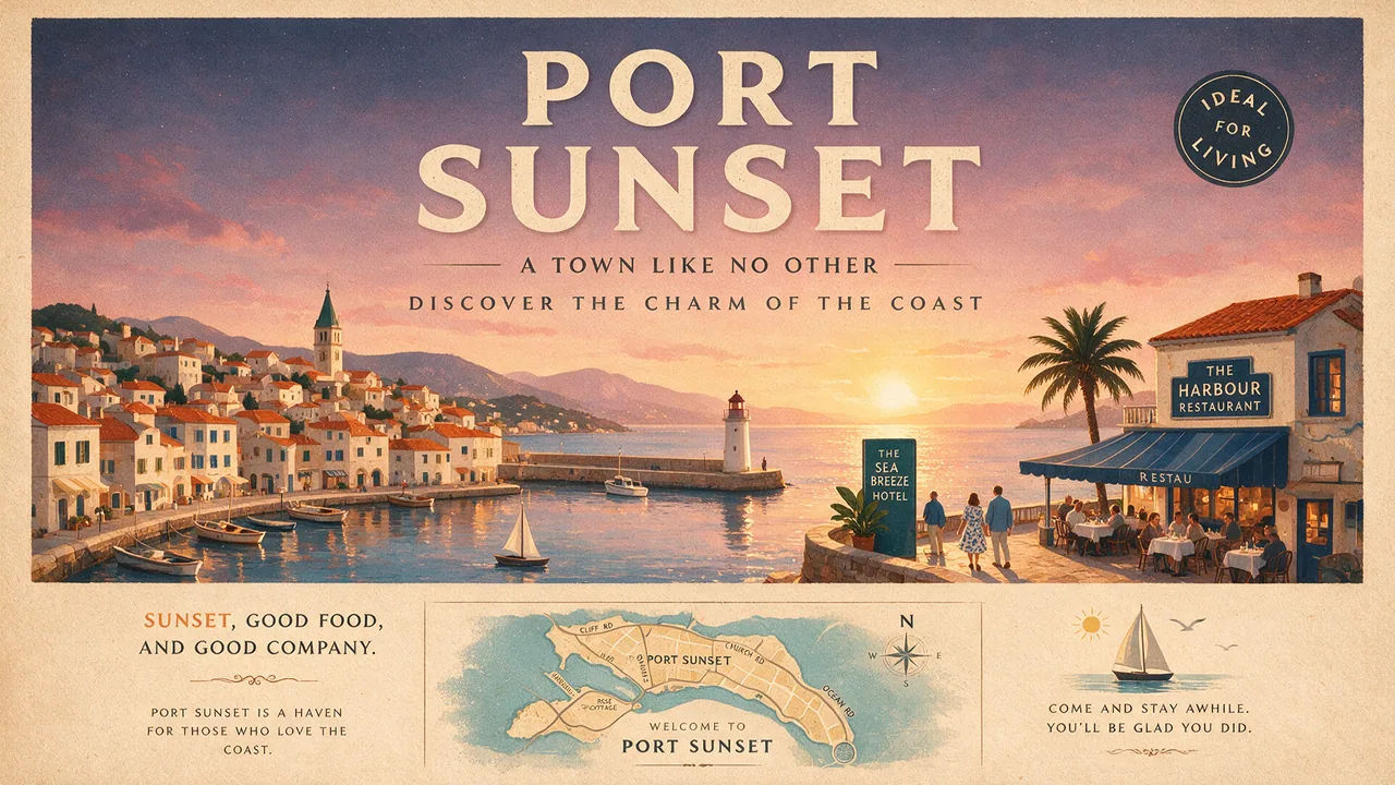
| travel poster, beautiful, high quality, 4k | A vintage travel poster of a harbour town at golden hour, warm flat color, the title across the top |
Start there, look at what comes back, then change one thing at a time.
Two additions worth making early. If you want a photograph, say "photorealistic" or "real photograph" outright, then describe the framing and the texture: 35mm film, medium close-up at eye level, shallow depth of field, subtle grain. Treat lens and film references as cues for how it should look, not as a physical simulation the model will reproduce exactly.
And say what you do not want. This is the single most useful line most people are missing. OpenAI's own photoreal examples end with instructions like "no glamorization, no heavy retouching" and "avoid cinematic lighting, dramatic color grading, or stylized composition". Naming the house style you are trying to escape is what removes the polished AI sheen; asking for realism alone rarely does it.
Getting text and layout right in an image
Put the exact words in quotation marks, say where they sit, and state how many times they should appear. That last part is what stops a tagline turning up twice.
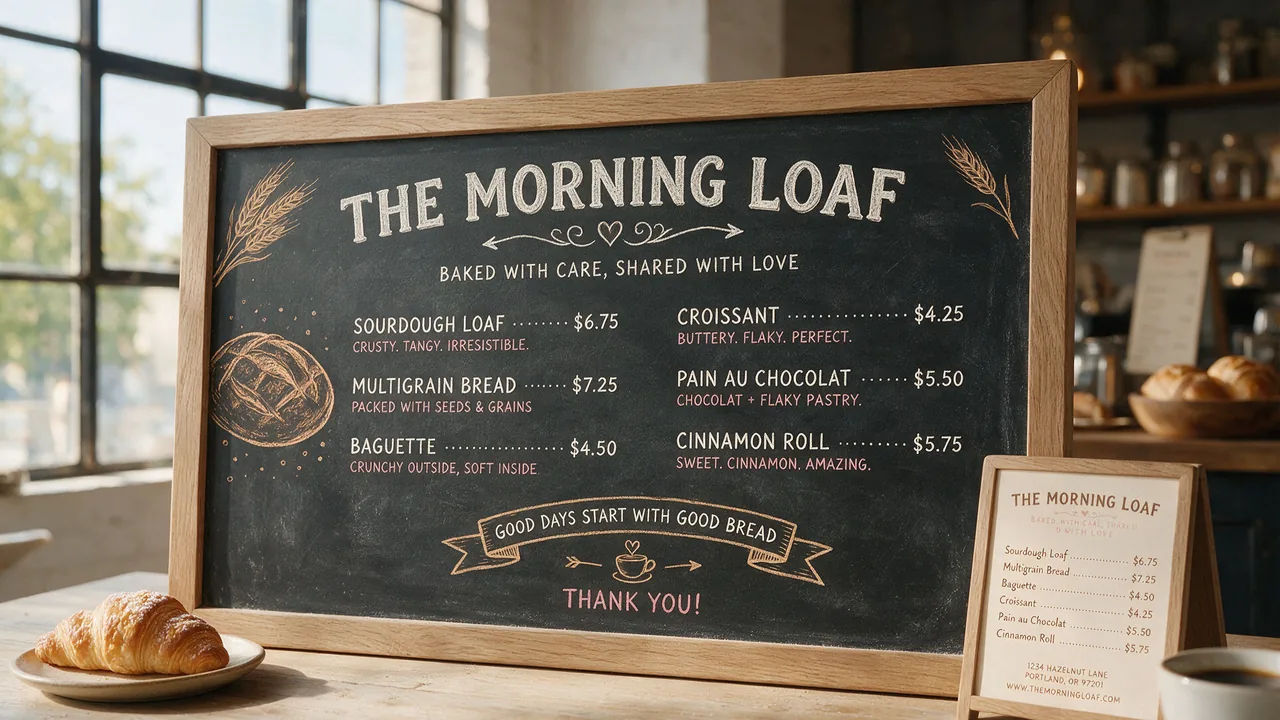
The full pattern from OpenAI's guide looks like this: quote the copy, mark it verbatim, place it, describe the typography, then close the door on anything else. "Billboard text (exact, verbatim): 'Fresh and clean'. Typography: bold sans-serif, high contrast, centered. Ensure the text appears once and is perfectly legible. No watermarks, no logos." Four requirements, none of them ambiguous.
A few smaller things that pay off. Spell unusual brand names letter by letter when the model keeps guessing at them. Keep wording short, since long runs of small type degrade first. And when the type is small or dense, compare high against xhigh before you settle, rather than assuming the top tier is always right.
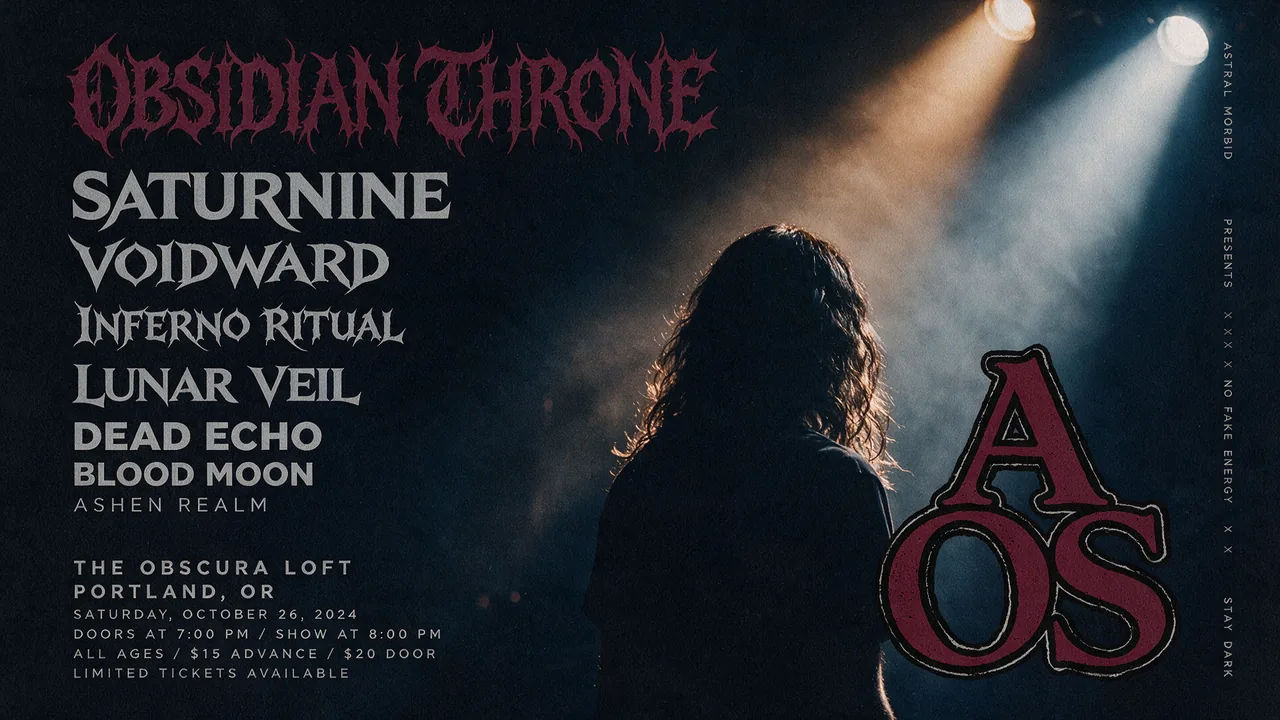
Once single lines work, name the parts of the layout separately instead of describing a mood. "A concert bill: headline act large at the top, four supporting acts stacked beneath in descending sizes, venue and date small at the base" gives the model a hierarchy to plan against.
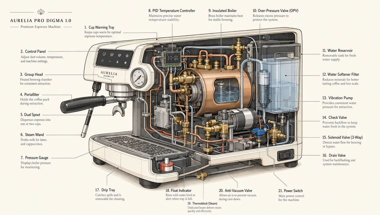
For a chart, a slide or a diagram, go further and write the prompt like a specification rather than an illustration request. Name the deliverable, give the real numbers and labels inline, name the typeface family, and forbid the clichés: no clip art, no stock photography, no decorative gradients. Landscape sizes suit deck work, and high quality is the floor once an image contains legends, axes or footnotes.
Editing an image without changing everything else
Editing is where most people lose a good image, and it is the thing this release improved most. The shape of a good edit prompt is a direct command followed by a preserve list.
| Do not write | Write instead |
|---|---|
| Make it darker and more premium, maybe move the logo | Change the label to matte black. Keep the lighting, framing and label text exactly as they are |
| Different chairs in this room | Replace ONLY the white chairs with wooden ones. Preserve camera angle, room lighting, floor shadows and surrounding objects |
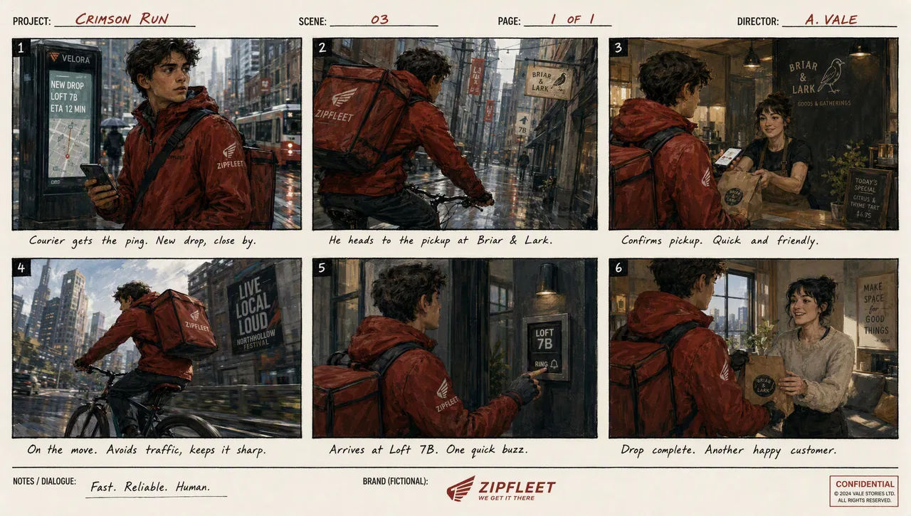
| The courier again, different scene | The same courier in a red jacket and grey scarf, now on a mountain pass. Do not redesign the character |
The preserve list should be longer than feels necessary. When OpenAI demonstrates a clothing swap, it pins face, facial features, skin tone, body shape, pose, likeness, expression, hairstyle, proportions, background, camera angle, framing and image quality before it says what may change. That is not over-writing. Every item you leave unnamed is an item the model is free to reinterpret.
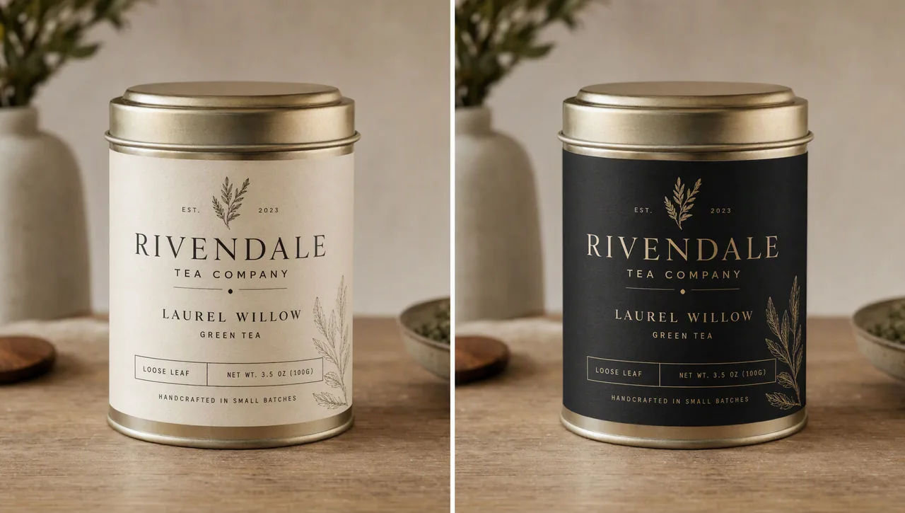
Follow-up turns should get shorter, not longer. After a heavy opening prompt, the next instruction can be a single line: "Make it look like a winter evening with snowfall." Feed the previous output back in, ask for one thing, and repeat the constraints that matter if you see them slipping.
Watch for drift anyway. 2.5 holds a chain together better than Images 2.0 did, but OpenAI still lists it as a known limitation, and when something you never asked about moves, go back to the last good version rather than correcting forward. Where a region has to stay pixel-identical, the honest fix is not a better prompt: composite the approved edit back into the original.
Keeping a character or product consistent
For a set that has to read as one world, do not describe the character again each time and hope. Build a reference image first.
Generate the character on their own, against a plain background, with the appearance, proportions, outfit and tone all specified. Then use that image as the input for every scene, and repeat the defining details in a short consistency block: same green hooded tunic, same facial features, proportions and palette, same personality, do not redesign the character.
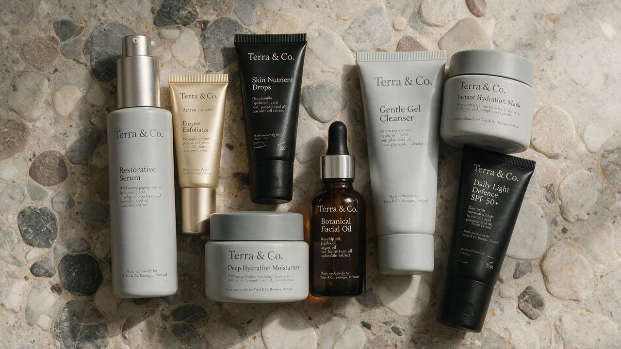
The same method applies to a product: the reference image carries the geometry and the label, and the prompt carries the instruction not to restyle it. Where the model can generate a batch from one prompt, use it. A set produced together holds better than six images made separately.
Transparent cutouts and product shots
Transparency needs two things at once: an isolated subject in the prompt, and a transparent background requested in the settings, with PNG or WebP output. JPEG cannot carry it.
The prompt vocabulary is specific, and worth copying. Isolate the product on a fully transparent background. Centered, crisp silhouette, no halos or fringing, clean alpha edges, generous padding. Preserve product geometry and label legibility exactly. Do not add a solid backdrop, scenery, checkerboard or shadow, and do not restyle the product.
Then verify it in the file rather than by eye. A drawn checkerboard is not transparency, and it is a common failure. If you carry the cutout into a further edit, repeat the requirement to preserve the transparent background, because it will not survive on its own.
Quality tiers and output sizes
ChatGPT Images 2.5 takes five explicit quality settings plus auto, and the top two are new in this generation.
| Setting | Use it for | Trade-off |
|---|---|---|
| low | Drafts, layout tests, iterating on wording | Fastest back |
| medium | Most finished work | The balanced default |
| high | Small text, dense diagrams, slides, portraits | Noticeably slower |
| xhigh | Fine print detail, print-bound assets | Slower again |
| max | The last resort when xhigh still falls short | Slowest by far |
The workflow that saves time is to raise the tier until the requirement is met, then step back down and check whether the quicker one still passes. A higher setting does not guarantee a better result for every prompt. Iterate on wording at low, then render the keeper once at the tier the job actually needs.
On size: output runs to 4K, with a maximum edge of 3840 pixels, both edges in multiples of 16, and aspect ratios between 1:3 and 3:1. Anything above 2560x1440 is marked experimental by OpenAI, which is worth knowing before you build a workflow on it. Square is also the most expensive shape at any given tier, so a 16:9 or 21:9 frame costs less than a 1:1 of the same nominal resolution.
Sketch, templates and shared prompts
The September release added four things to ChatGPT itself, alongside the model.
Sketch lets you draw directly in ChatGPT and use the drawing as a guide. Type @Sketch, draw a rough layout or silhouette, confirm it, then describe the image you want built from it. It is the fastest way to pin a composition that written description keeps getting wrong. When you use it, tell the model to preserve the layout, proportions and perspective of the sketch, choose realistic materials and lighting, and add no new elements or text, or it will reinterpret your drawing rather than render it.
Templates give a starting point for common formats such as a poster or merchandise, then ask follow-up questions to fill in the details. They are not yet available in Work mode.
Comments can be placed directly on an image to aim an edit at one spot, and the editor's selection tool does the same job by region, though OpenAI warns that highlights are not always precise and an edit can extend past the area you marked.
Shared prompts let you share a finished image together with the prompt behind it, so someone else can run the same idea with their own photos.
What to check before you use the image
Four checks, in this order, catch nearly everything.
Is the text accurate and legible, and does it appear the number of times you asked for? Are the labels and relationships in a diagram actually correct, rather than merely tidy? Did identities, product shapes and label text survive the edit intact? And did the edit change only what you asked, or has something quietly moved?
If transparency was part of the brief, check for a real alpha channel in the file. If the image is going to print, view the small type at full size rather than in a thumbnail, since that is exactly where a tier that was almost good enough gives itself away.
ChatGPT Images 2.5 runs on Morphic for both generating and editing, with up to 10 reference images, output to 4K, and the full set of quality tiers. The same prompt can go to Nano Banana Pro, Seedream 5 Pro or Flux 2 Pro on the same Canvas, which is the quickest way to find out whether the model is the constraint or the prompt is.